less than a minute read • Updated 3 months ago
Getting started with Foxy's Gift Card Element
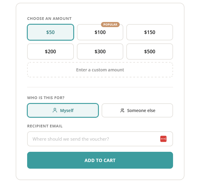
Our drop-in gift card form allows you to easily sell digital gift cards, with pre-set or custom amounts, recipient email delivery, optional personal messages, and a fully configurable theme that matches your store's branding.
Quick Start
Add a container element anywhere on your page, include the script, and call init with your store's subdomain:
<div id="gift-card-form"></div>

<script src="https://cdn-js.foxy.io/website-helpers@1/foxy-gift-cards.js"></script>
<script>
  FoxyGiftCard.init({
    element: '#gift-card-form',
    subdomain: 'your-store.foxycart.com',
  });
</script>
The form renders inside the container and submits directly to your Foxy Cart.
Full Example
<!DOCTYPE html>
<html lang="en">
<head>
  <meta charset="UTF-8">
  <meta name="viewport" content="width=device-width, initial-scale=1.0">
  <link href="https://fonts.googleapis.com/css2?family=Open+Sans:wght@400;500;600;700&display=swap" rel="stylesheet">
</head>
<body>

  <div id="gift-card-form"></div>

  <script src="https://cdn-js.foxy.io/website-helpers@1/foxy-gift-cards.js"></script>
  <script>
    FoxyGiftCard.init({
      element: '#gift-card-form',
      subdomain: 'http://example.foxycart.com',
      productName: 'Gift Card',
      codePrefix: 'gift_card',
      category: 'gift_card',
      giftCardCode: 'gc',
      currency: '€',
      amounts: [
        '50{c:gift_card_50}',
        100,
        150,
        200,
        300,
        500
      ],
      highlightedAmount: 100,
      defaultAmount: 50,
      allowCustomAmount: true,
      customAmountMin: 10,
      customAmountMax: 1000,
      labels: {
        submitText: 'Buy Gift Card',
      },
      theme: {
        accent: '#3c9c9e',
        highlight: '#c8956c',
      },
    });
  </script>

</body>
</html>'
Configuration
Every option is optional except element and subdomain. Pass only what you need to override.
Store & Product
element
CSS selector or DOM element to mount the form into. Default: '#foxy-giftcard'
subdomain
Your Foxy store domain. This can be the standard Foxy subdomain or a custom domain. The library appends /cart automatically using the URL Web API. Default: ''
// Standard Foxy subdomain
subdomain: 'mystore.foxycart.com'

// Custom domain
subdomain: 'shop.mybrand.com'

// Also works with full URLs
subdomain: 'https://mystore.foxycart.com'
productName
The product name sent to Foxy in the hidden name field. Default: 'Gift Card'
codePrefix
The prefix used to build the product code. How the full code is built depends on whether giftCardCode is set and whether the amount has its own override (see Amounts below). Default: 'gift_card'
giftCardCode
The main gift card SKU from your Foxy admin. When set, the default product code for all amounts becomes {codePrefix}_{giftCardCode}. For example, with codePrefix: 'gift_card' and giftCardCode: 'gc', the code sent to Foxy is gift_card_gc. Individual amount overrides take priority over this value. Default: ''
category
The Foxy product category. Default: 'gift_card'
templateSet
A Foxy template set code. When set, the library adds a hidden template_set input to the form with this value. Leave empty to omit. Default: ''
Currency & Amounts
currency
The symbol shown on amount buttons and inside the custom amount input. Default: '€'
amounts
An array of predefined amounts shown as selectable buttons. Each entry can be a plain number or a string with a product code override.
A plain number uses the standard code resolution (giftCardCode if set, otherwise the amount itself). A string with the {c:...} syntax sends the exact code inside the braces, bypassing the default code logic entirely.
Default: [50, 100, 150, 200, 300, 500]
amounts: [
  '50{c:gift_card_50}',   // sends product code "gift_card_50"
  100,                      // sends "gift_card_custom" (when giftCardCode is 'custom')
  150,
  200,
  300,
  500
]
The code resolution priority for each amount is:
highlightedAmount
Which amount gets a badge displayed above the button. Set to null to disable. Default: 100
defaultAmount
The pre-selected amount when the form first renders. Default: 50
allowCustomAmount
Show a "custom amount" toggle that reveals a freeform number input. Default: true
customAmountMin
Minimum value accepted in the custom amount input. Default: 1
customAmountMax
Maximum value accepted in the custom amount input. Default: 10000
Recipient
showRecipientToggle
Show the "Myself / Someone else" toggle. When "Someone else" is selected, additional fields appear for the recipient's name, the sender's name, and an optional personal message. Default: true
showMessageField
Show the optional message textarea when "Someone else" is selected. Default: true
Note: The recipient email field is always present and required. Gift cards need an email address for Foxy to deliver the voucher.
Labels
All user-facing strings are configurable through the labels object. Override any individual string to localise or customise the form. You only need to include the strings you want to change.
labels: {
  amountHeading:          'Choose an amount',
  customAmountButton:     'Enter a custom amount',
  customAmountPlaceholder:'Enter amount',
  highlightedBadge:       'Popular',
  recipientHeading:       'Who is this for?',
  recipientMyself:        'Myself',
  recipientSomeoneElse:   'Someone else',
  emailLabel:             'Recipient email',
  emailPlaceholder:       'Where should we send the voucher?',
  shiptoLabel:            "Recipient's name",
  shiptoPlaceholder:      'Who is receiving this gift?',
  fromLabel:              'Your name',
  fromPlaceholder:        'Who is sending this gift?',
  messageLabel:           'Message',
  messageLabelNote:       '(optional)',
  messagePlaceholder:     'Add a personal note...',
  submitText:             'Add to Cart',
}
Amount section strings
amountHeading — heading above the amount buttons grid. customAmountButton — text on the dashed custom amount toggle. customAmountPlaceholder — placeholder inside the custom amount input. highlightedBadge — text on the badge above the highlighted amount button.
Recipient section strings
recipientHeading — heading above the Myself / Someone else toggle. recipientMyself — label on the "Myself" pill button. recipientSomeoneElse — label on the "Someone else" pill button.
Email strings
emailLabel — label above the email input. emailPlaceholder — placeholder inside the email input.
Someone-else field strings
shiptoLabel — label above the recipient name input. shiptoPlaceholder — placeholder inside the recipient name input. fromLabel — label above the sender name input. fromPlaceholder — placeholder inside the sender name input. messageLabel — label above the message textarea. messageLabelNote — lighter text appended to the message label (e.g. "(optional)"). messagePlaceholder — placeholder inside the message textarea.
Submit string
submitText — text on the submit button.
Theme
Override any of the following properties inside a theme object to match your brand. You only need to include the properties you want to change.
theme: {
  accent:       '#3c9c9e',                    // Primary color — buttons, focus rings, selected states
  accentDark:   '#2d7a7c',                    // Hover state for primary elements
  accentSubtle: 'rgb(60 156 158 / 0.09)',     // Light tint used as selected backgrounds
  text:         '#1a1a1a',                    // Primary text color
  textMedium:   '#4a4a4a',                    // Secondary text (pill buttons)
  textLight:    '#888',                       // Tertiary text (labels, placeholders)
  border:       '#e5e2dd',                    // Border color for inputs and card
  highlight:    '#c8956c',                    // Highlighted badge background color
  surface:      '#ffffff',                    // Card and input background
  radius:       '16px',                       // Card corner radius
  radiusSmall:  '10px',                       // Button and input corner radius
  fontFamily:   "'Open Sans', sans-serif",    // Font stack for the entire form
}
Callbacks
Three optional hooks let you react to user actions or intercept form submission.
onAmountChange(amount, isCustom)
Fires when the user selects a preset amount or types a custom value.
amount is the numeric value. isCustom is true when the value comes from the custom input, false for preset buttons.
onAmountChange(amount, isCustom) {
  console.log('Selected:', amount, isCustom ? '(custom)' : '');
}
onRecipientChange(type)
Fires when toggling between "Myself" and "Someone else".
type is either 'myself' or 'someone-else'.
onRecipientChange(type) {
  console.log('Recipient:', type);
}
onBeforeSubmit(formData)
Fires when the form is submitted. Return false to prevent the submission.
formData is a plain object with all form field name/value pairs.
onBeforeSubmit(formData) {
  console.log('Submitting:', formData);
  // return false; // uncomment to block submission
}
Cleanup
init returns a handle you can use to remove the form and its styles later:
const giftCard = FoxyGiftCard.init({
  element: '#gift-card-form',
  subdomain: 'your-store.foxycart.com',
});

// Later, to tear down:
giftCard.destroy();
CSS Classes
All classes are scoped to your mount element and prefixed with foxy-gc-. You can use them to add custom style overrides on top of the theme config.
Card layout
foxy-gc-form-card — outer card wrapper. Controls the border, padding, max-width, corner radius, and the entrance animation.
Amount selection
foxy-gc-amount-grid — the 3-column grid layout that holds the preset price buttons.
foxy-gc-amount-button — an individual price button. Controls the size, border, font, and hover state.
foxy-gc-amount-button--selected — the active state applied to the currently selected button. Adds the accent border and background tint.
foxy-gc-amount-highlighted-tag — the small badge (e.g. "Popular") that floats above a button.
foxy-gc-custom-toggle — the dashed-border "Enter a custom amount" button.
foxy-gc-custom-toggle--selected — the active state when the custom input is open. Switches the border to solid and applies the accent tint.
foxy-gc-custom-input-wrapper — the container for the custom number input. Hidden by default.
foxy-gc-custom-input-wrapper--visible — makes the custom input container visible.
foxy-gc-custom-currency-symbol — the currency symbol (e.g. €) positioned inside the custom input.
Form fields
foxy-gc-form-field — the wrapper around each label + input pair. Controls spacing.
foxy-gc-form-field--hidden — hides a field. Used on the conditional "someone else" fields.
foxy-gc-field-label — the uppercase label above each input.
foxy-gc-field-label-note — lighter inline text within a label (e.g. "(optional)").
foxy-gc-text-input — single-line text, email, and number inputs. Controls the border, padding, focus ring, and placeholder color.
foxy-gc-textarea — the multi-line message input. Controls the min-height and resize behavior.
foxy-gc-section-divider — the horizontal line separating form sections.
Recipient toggle
foxy-gc-recipient-toggle — the flex row containing the two pill buttons.
foxy-gc-recipient-pill — an individual toggle pill (Myself or Someone else).
foxy-gc-recipient-pill--selected — the active state. Adds the accent border and background tint.
Submit
foxy-gc-submit-button — the full-width CTA. Controls the background, text color, padding, and hover shadow.
Want something different? No problem.
This Gift Card widget is just one way to sell Gift Cards on your website using Foxy. You can of course create "normal" cart links and forms if you have specific needs.